UI Foundations Kit home pagelight logodark logo
  • Support
  • Buy Now
  • Buy Now
Tools & Modules
Forms
  • Documentation
  • Kit Components
  • Live Demo
  • Buy Now
  • Get Started
    • Introduction
    • Quickstart
    • Structure
    • Deployment
    • Optimization
    • Integration
    Theme Tokens
    • Colors
    • Typography
    • Icons
    • Border Radius
    • Shadows
    Tools & Modules
    • Dark Mode
    • CMD + K
    • Data Grids
    • Tours & Walkthroughs
    • Threshold Filters
    • Help Menu
    • Confirm Dialogs
    • Forms
    • CSS Variables
    Kit Components by Category
    • Overview
    • App Layout - Sidebar
    • App Layout - Stacked
    • Application app layouts dual
    • Buttons
    • Stats
    • Avatars
    • Menus
    • Badges
    • Lists - Tables
    • Lists - Card Grids
    • Layout - Containers
    • Layout - Dividers
    • Layout - Decorations
    • Forms - Authentication
    • Forms - Inputs
    • Forms - Selects
    • Nav - Navigation Bars
    • Nav - Breadcrumbs
    • Overlays - Drawers
    • Overlays - Help Menus
    • Overlays - Notications
    • Page Sections - Hero
    • Page Sections - Features
    • Theme Definition
    Tools & Modules

    Forms

    Getting user input and managing form state

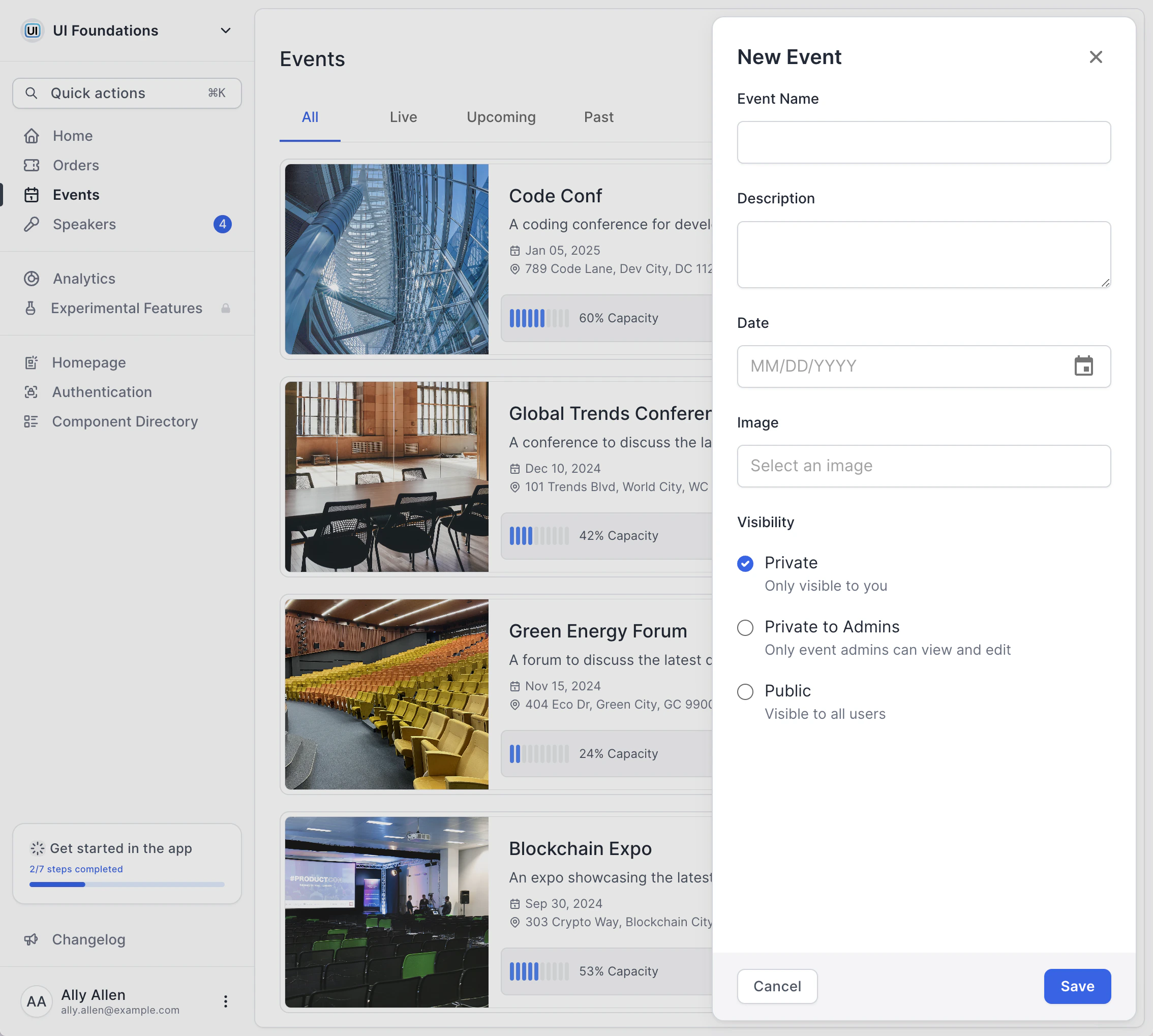
    UI Foundations Kit reskins the MUI form control components, mainly the <FilledInput /> to obtain a distinct visual style.

    Within the Kit are examples of input fields, text areas, image uploads, and radio groups like in the above image. All components provided by MUI are available for use as well, but with a nice, new look and feel.

    Confirm DialogsCSS Variables
    xgithub
    Powered by Mintlify