theme.ts file and replacing the ThemeProvider with the one provided by UI Foundations Kit, but it may also mean extending bits of your own theme instead.
Additive Changes
Instead of replacing how functionality from the base MUI theme, UI Foundations Kit is additive and extends the base MUI theme. This means that you can easily add features from UI Foundations Kit and let them live alongside your own components and features with little to no conflicts. The following are some of those changes:Many of these additive changes are relied on by Kit components and the base template, so copying components into your own project will require porting each behavior for full compatibility.
TypeScript Augmentation
In the TypeScript version of the Kit, there are a few places where UI Foundations Kit extends the base MUI defaults, these are:- Typography: to add utilities familiar to those used to strategies like Tailwind or Chakra UI like
2xs,xs,sm,md,lg,xl,2xl, etc. - Colors: which add several Tailwind compatible color palettes to the theme, including
red,orange,yellow,green,blue,fuchsia,violet,gray, with more easily added. You’ll find these declarations in thetheme.tsfile that add to the default types.
Icons
Instead of the base MUI icons, UI Foundations Kit uses Tabler icons viareact-icons.
A few defaults are set in the theme.ts file to improve the base look of components like checkboxes and radio buttons, but for the most part the icons are imported and used where needed.
However, this means that integrating the theme into your own project will require installing the react-icons package or removing these overrides.
Component Defaults
MUI allows customization of components via thecomponents prop on the ThemeProvider. UI Foundations Kit includes many adjustments for base components like Button, TextField, and Select to make them more consistent with the kit and feel more modern.
These can be ported over by copying over the contents, or merging component styleOverrides and defaultProps from the Kit’s theme.ts file with any you’ve set yourself.
Global Styles
Finally, UI Foundations Kit includes a few global styles to improve the look of the base layout components, including:body: Sets aminHeight- focus outlines using
focusVisible: to use a box shadow instead of a border - universal box sizing: to use
border-boxas a nicer default for all elements
global.ts in the Kit, or merging with your own global styles.
Unused or Discouraged features
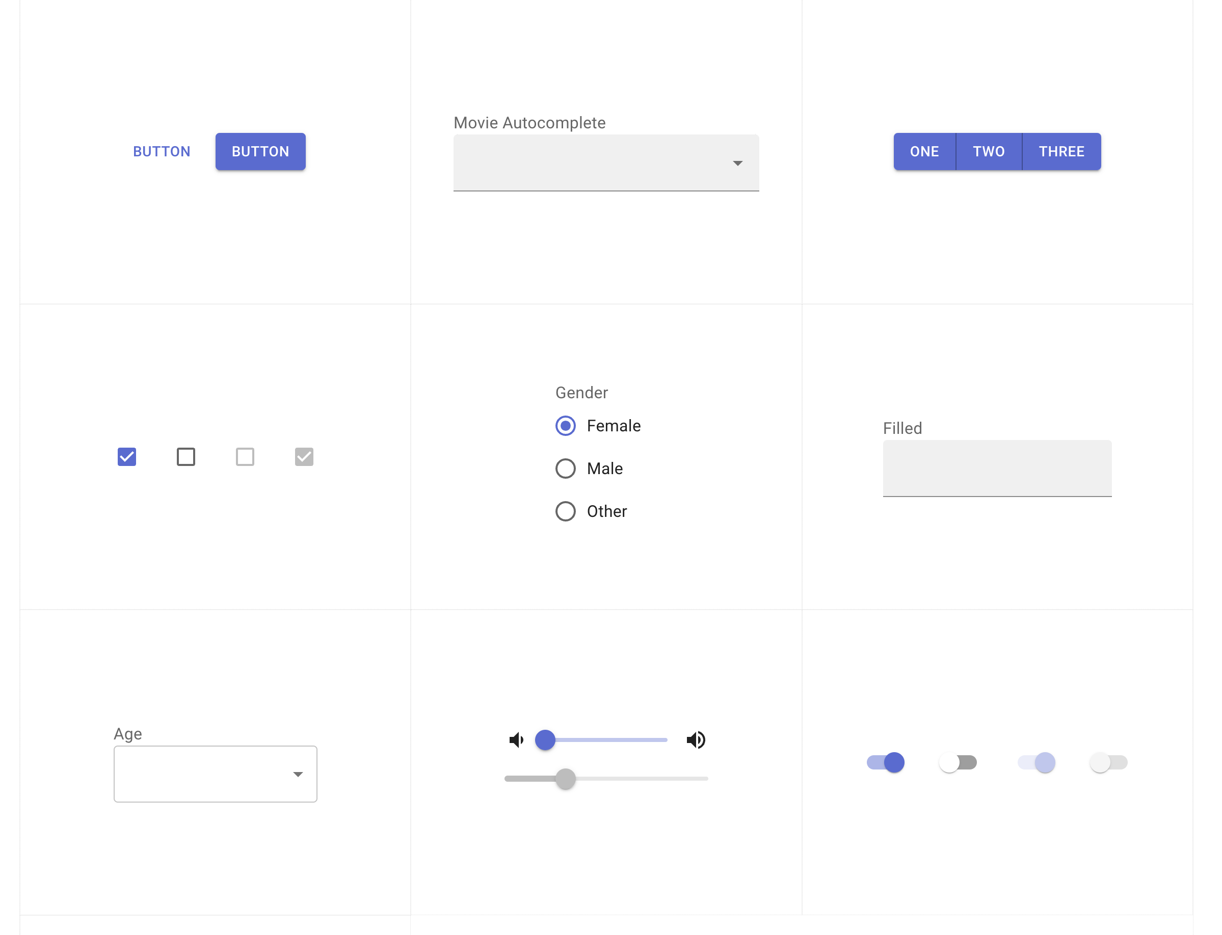
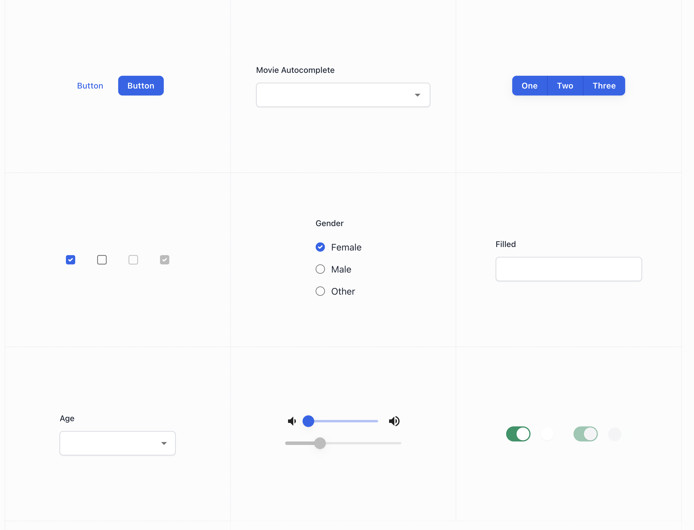
UI Foundations Kit also avoids using a few features of MUI to keep things consistent. With the MUI components being extensive enough to bend however you want, UI Foundations Kit avoids allowing you to use multiple different ways to style the same components. This means there are a few cases to be aware of that are discouraged to maintain a consistent look: Avoid labels on TextField components: MUI allows labels to be defined as a prop of theTextField component, but UI Foundations Kit uses labels via the FormLabel component instead. It also often uses FormControl and the more low level FilledInput component instead:
outlined or filled variants, but UI Foundations Kit uses filled by default. This means that you’re encouraged to use the filled variants on all form inputs:
fontSize on components like Box and Container to enforce consistency. Instead, it uses the sx prop, which is a more powerful and flexible way to style components.
In MUI v6, this became the default for all components, so this is less of an issue in up-to-date setups.
Sample Migration
For help integrating in your own project, you can refer to this sample repository that demonstrates the steps to copy and replace a ThemeProvider in a simple project: UI Foundations Kit Sample Migration| Before | After |
|---|---|
 |  |
Differences between MUI v5 and v6
MUI v6 introduced a few changes that may affect how you integrate the UI Foundations Kit if you wish to integrate with a project that is still on v5.UI Foundations Kit is built against MUI v6, so if you are using v5 you will need to make some changes, it is recommended that you upgrade to v6 for the best experience.
ThemeProvider
MUI v6 stabilized the experimentalCssVarsProvider which was merged into it’s main ThemeProvider. This means that there are a few new props to be aware of that are documented in their migration guide.
If you are still working on a MUI v5 project, be sure to be aware of the following:
extendThemeis nowcreateThemeCssVarsProvideris nowThemeProvider- the
cssVariablesprop only exists on the v6 provider, and the experimental v5 CssVarsProvider