

What is UI Foundations Kit?
UI Foundations Kit is a SaaS starter for MUI apps. It contains components, hooks, styles, and modules helpful for developers that are building dashboards for consumers, businesses, or internal teams. It’s main differentiating factor is its beautiful default theme.Comparisons
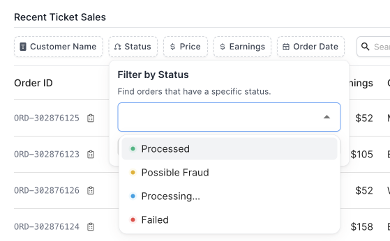
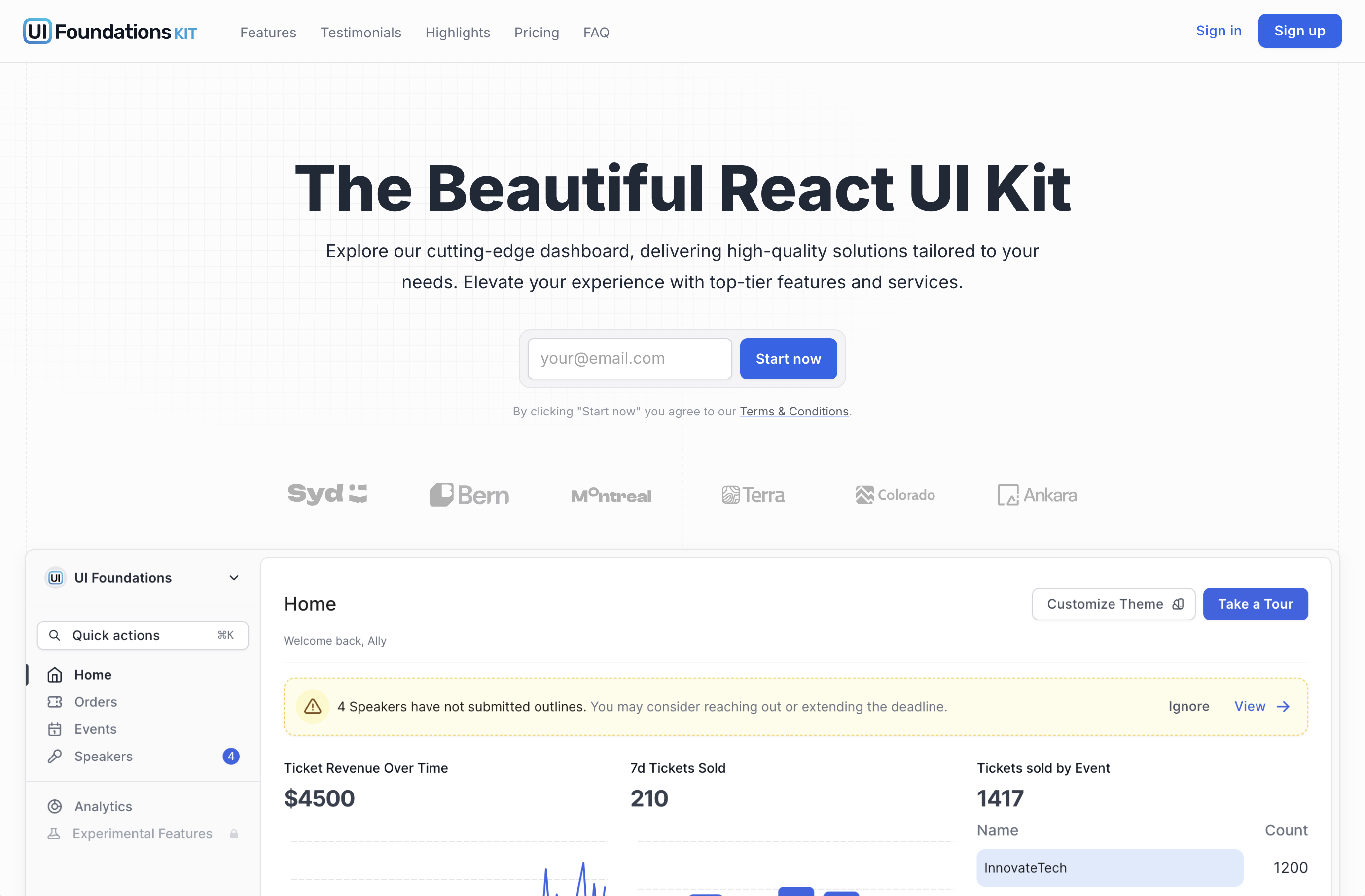
The following comparison screenshots demonstrate some of the differences between the default Material Design theme and the UI Foundations theme, which makes it easier to pick up and make beautiful apps.MUI Filters
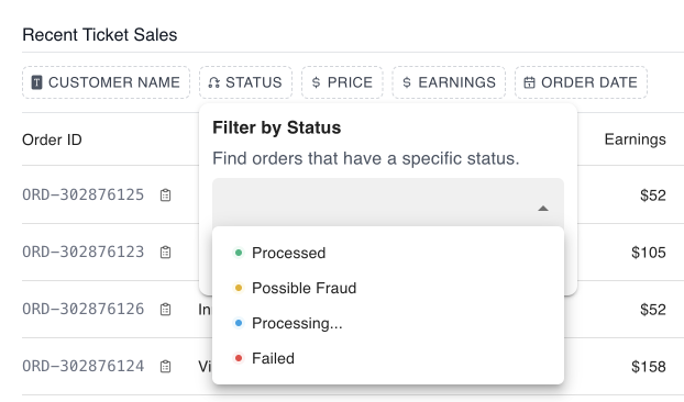
UI Foundation Filters
MUI Actions
UI Foundation Actions
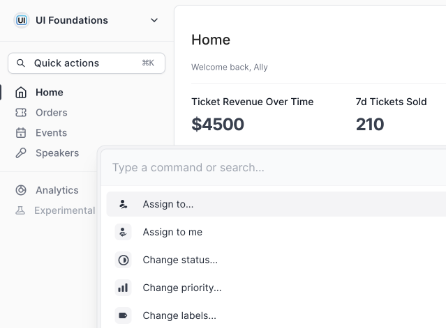
MUI CMD + K
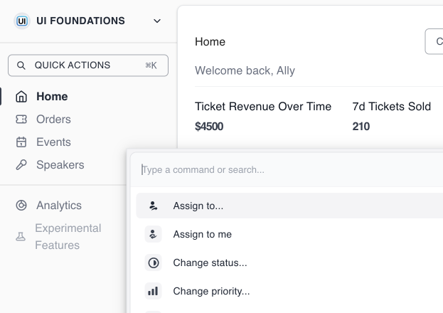
UI Foundation CMD + K
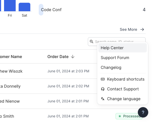
MUI Help Menu
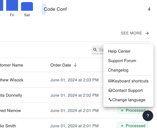
UI Foundation Help Menu
MUI Shadows
UI Foundation Shadows
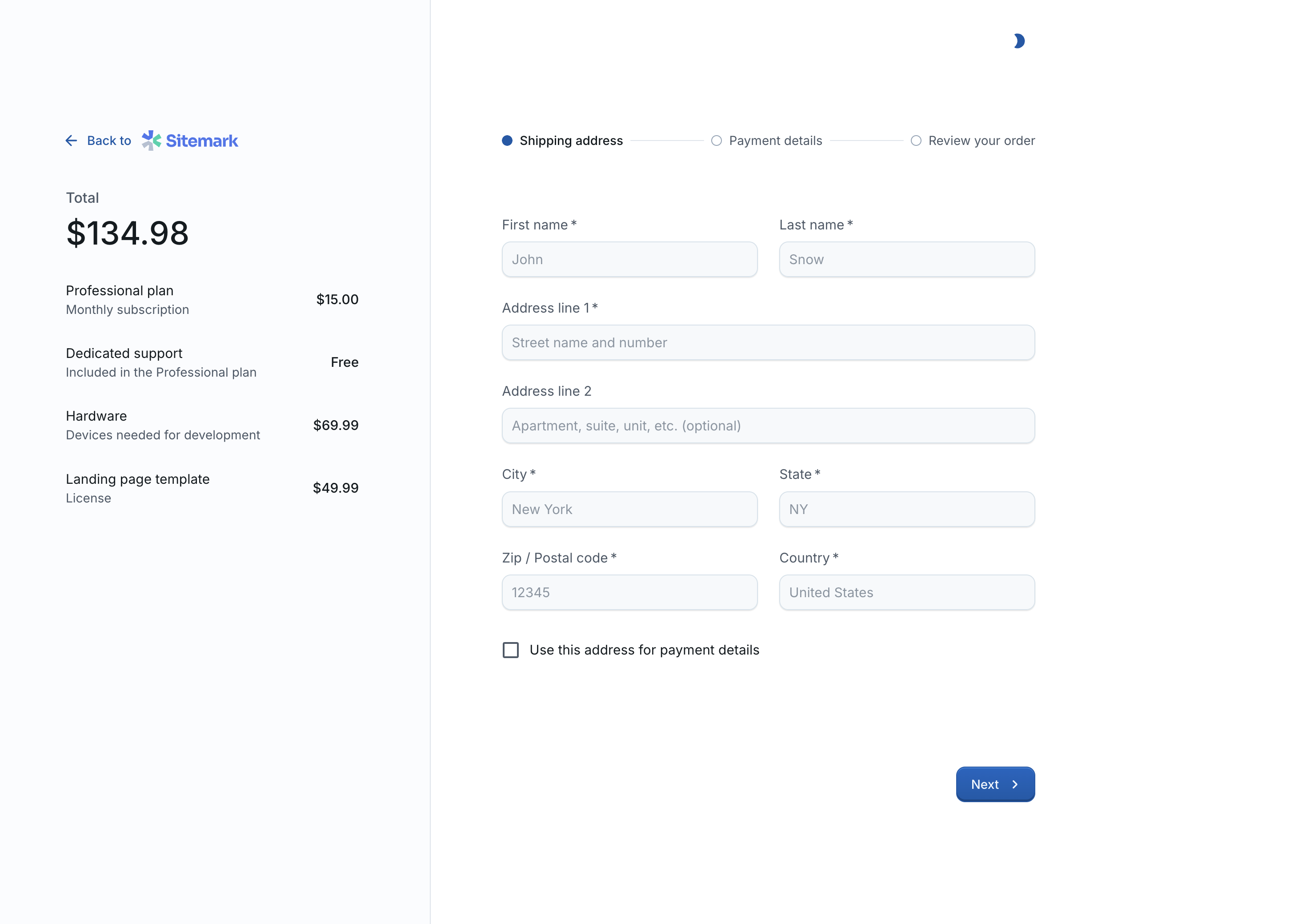
MUI Checkout
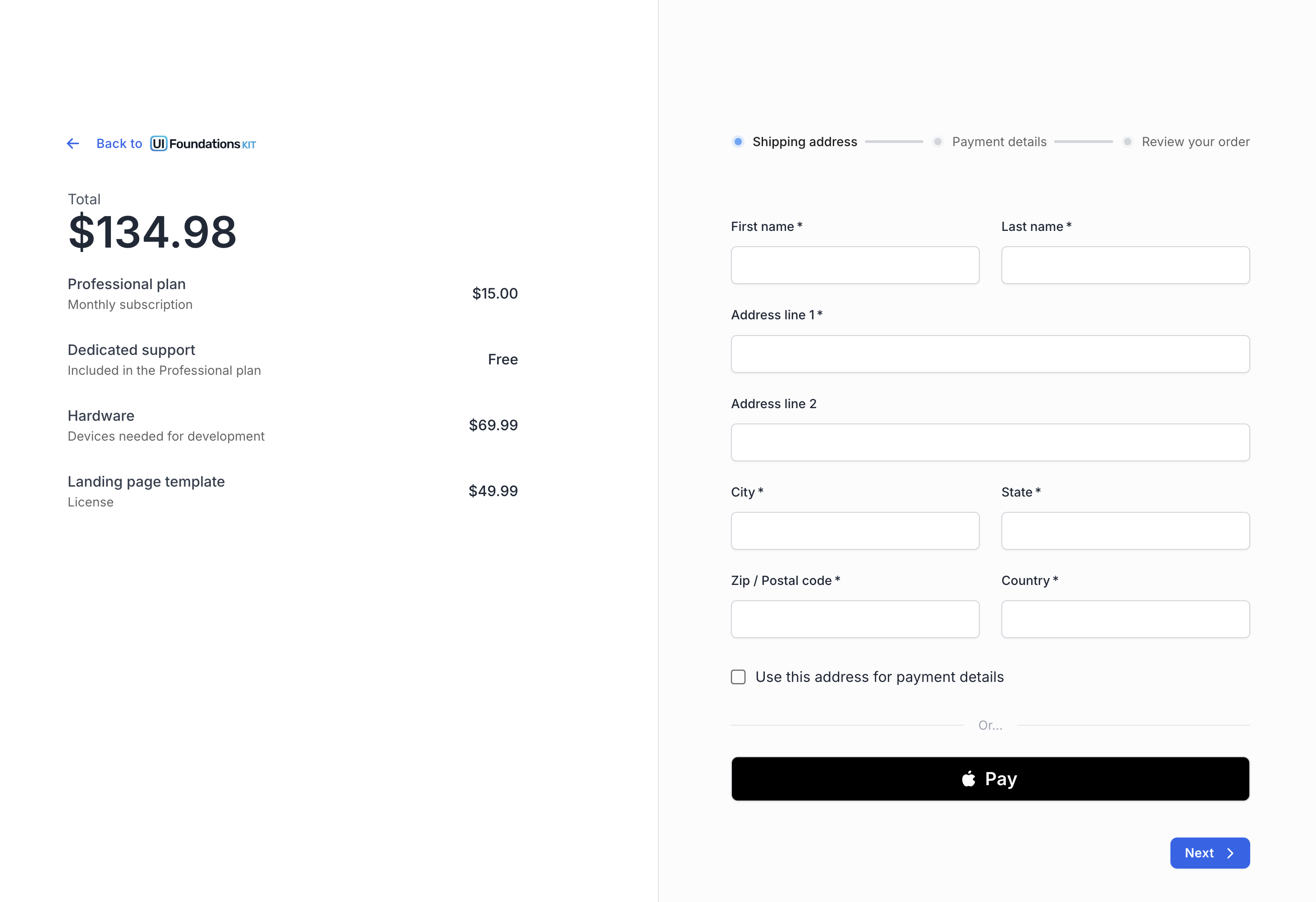
UI Foundation Checkout
MUI Landing Page
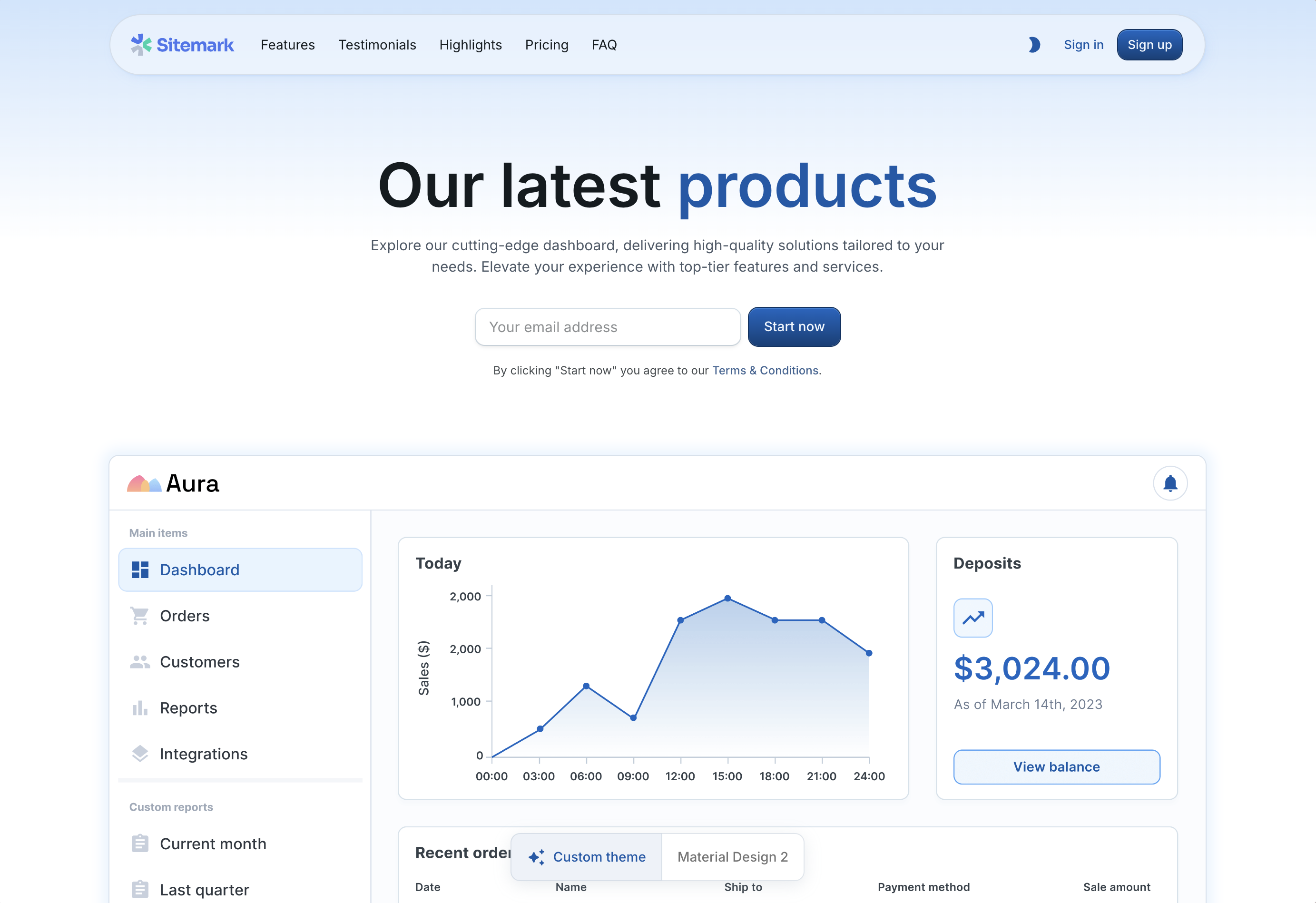
UI Foundation Landing Page
- disabling of the button ripple effect
- sharper borders
- softer grays
- harmonic typography
- and more
What’s Included
UI Foundations Kit offers all the bells and whistles you’d expect from a modern dashboard starter, including:- 🧭 In-app Tours - replace paid SaaS tools with a custom implementation for orienting new users, and highlighting elements using your own custom components
- ⌘ Command Launcher - a global search bar that can be used to navigate your app, or execute commands, already assembled and ready to go
- 📂 Custom Filters - a commonly implemented filtering pattern with great TypeScript support, as well as threshold based filters (
field:priceoperator:>value:50) that integrates with the<DataGrid />, or your own custom backend - 🔠 Harmonic Typography - automatically adjusting harmonic typography that adjusts tracking (or line-height) for you, anywhere you use the
<Typography />component - 🎨 Palette/Theme Switcher - match your brand with any color/font/border-radius combination, modifiable in app
- 🌗 Dark Mode - built-in, without any flicker (FOUC) for all components
- 🧰 Beautiful Native MUI components - everything you’ve come to know from MUI like the
<DataGrid />, the<DateRangeChanger />, but with better default styles - 📱 Fully responsive designs - looks great on mobile, desktop, tablet, etc
- 🎆 Image file uploads - file type inputs with well styled controls and image previews
- 📊 Themed Charts - MUI X Charts that match your brand and clean up default styles
CSSVarsProvider for theming based on CSS variables.
The best way to get a feel for what is available is clicking around the live demo yourself!
Pre-built components
There are 2 types of components pre-built in the UI Foundations Kit:- Kit Components: (preview) with zero dependencies (besides MUI) and designed to be easily copy/pasted into any React project using MUI
- App Components: (preview) with more complex logic and state management, to demonstrate how to use the theme in a real-world application