> ## Documentation Index
> Fetch the complete documentation index at: https://docs.uifoundations.com/llms.txt
> Use this file to discover all available pages before exploring further.
# Data Grids
> Supplemental data grid components for use in applications.
UI Foundations Kit builds on top of the MUI Data Grid and reskins it with a simplified theme. To swap between the variants of the table you can refer to the `Table` component in the source code.
## Usage
You can import from `/src/components/Table` and apply a different variant to change styles from `simple` or `standard` (the MUI default):
```tsx theme={null}
import { Table } from 'src/components/Table';
export default function MyComponent() {
return (
);
}
```
In addition, UI Foundations Kit includes additional classes that can be applied to rows in your tables to disable, or mark them as errored or alerted. These classes are applied with the `getCellClassName` and `getRowClassName` functions.
```tsx theme={null}
import { Table } from 'src/components/Table';
export default function MyComponent() {
return (
{
if (params.row.error) {
return 'datagrid-row-error';
}
return '';
}}
getRowClassName={(params) => {
if (params.row.disabled) {
return 'datagrid-row-disabled';
}
return '';
}}
/>
);
}
```
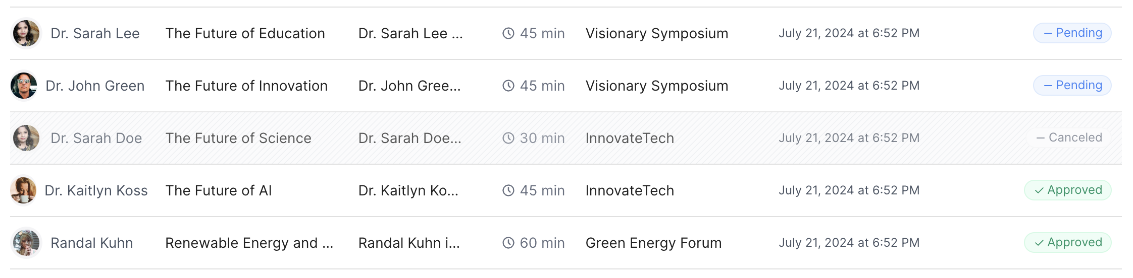 This will apply a background pattern to specific rows, to mark data as disabled or errored. You can customize these classes in your theme file to match your app's design language if it differs from our defaults.