> ## Documentation Index
> Fetch the complete documentation index at: https://docs.uifoundations.com/llms.txt
> Use this file to discover all available pages before exploring further.
# Shadows
> Elevation and shadows throughout the UI Foundations Kit.
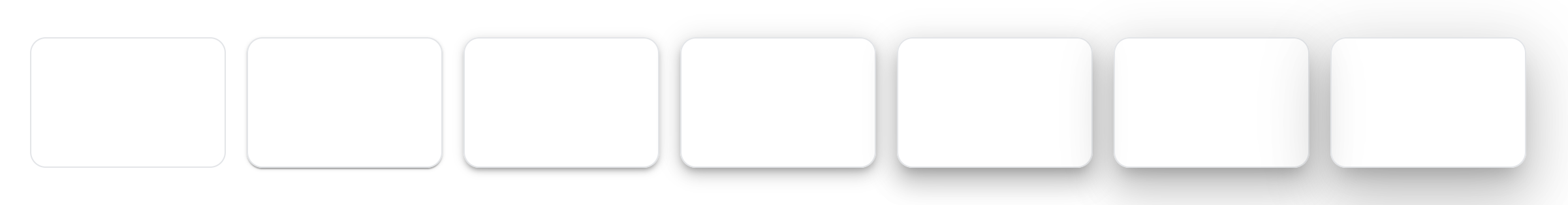
The default MUI theme includes a set of shadows that can be used to show varying levels of elevation. These shadows consist of 25 levels, ranging from `0` to `24`. UI Foundations Kit uses a small subset of shadows, to enforce a consistent design language across all components. Instead of 25 levels, UI Foundations Kit uses 6 levels of shadows, ranging from a subtle border like shadow to a more pronounced shadow for modals and dialogs.
You can see a comparison between the UI Foundations theme and the default MUI theme below:
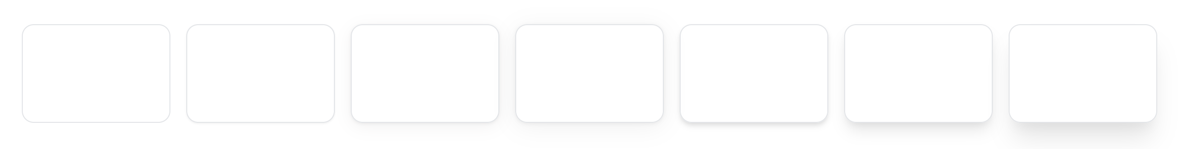 This is how it is implemented in the theme file:
```ts theme.ts theme={null}
shadows: [
'none',
'0 1px 2px 0 rgb(0 0 0 / 0.05)', // border-like
'0 1px 3px rgb(44 42 38 / 7%), 0 4px 16px rgb(44 42 38 / 6%)', // xs
'0 1px 4px rgb(44 42 38 / 7%), 0 4px 24px rgb(44 42 38 / 7%)', // sm
'0 4px 6px -1px rgba(0, 0, 0, 0.1), 0 2px 4px -1px rgba(0, 0, 0, 0.06)', // md
'0 10px 15px -3px rgba(0, 0, 0, 0.1), 0 4px 6px -2px rgba(0, 0, 0, 0.05)', // lg
'0 20px 25px -5px rgba(0, 0, 0, 0.1), 0 10px 10px -5px rgba(0, 0, 0, 0.04)', // xl
'0 1px 2px 0 rgb(0 0 0 / 0.05)', // defaults back to the border-like shadow
'0 1px 2px 0 rgb(0 0 0 / 0.05)',
// ... continued for all the remaining levels
] as Shadows,
```
By default, components like the button are already preconfigured to output softer shadows, but you can add shadows to other components as you see fit like this:
```tsx theme={null}
Paper with a shadow
```
This is how it is implemented in the theme file:
```ts theme.ts theme={null}
shadows: [
'none',
'0 1px 2px 0 rgb(0 0 0 / 0.05)', // border-like
'0 1px 3px rgb(44 42 38 / 7%), 0 4px 16px rgb(44 42 38 / 6%)', // xs
'0 1px 4px rgb(44 42 38 / 7%), 0 4px 24px rgb(44 42 38 / 7%)', // sm
'0 4px 6px -1px rgba(0, 0, 0, 0.1), 0 2px 4px -1px rgba(0, 0, 0, 0.06)', // md
'0 10px 15px -3px rgba(0, 0, 0, 0.1), 0 4px 6px -2px rgba(0, 0, 0, 0.05)', // lg
'0 20px 25px -5px rgba(0, 0, 0, 0.1), 0 10px 10px -5px rgba(0, 0, 0, 0.04)', // xl
'0 1px 2px 0 rgb(0 0 0 / 0.05)', // defaults back to the border-like shadow
'0 1px 2px 0 rgb(0 0 0 / 0.05)',
// ... continued for all the remaining levels
] as Shadows,
```
By default, components like the button are already preconfigured to output softer shadows, but you can add shadows to other components as you see fit like this:
```tsx theme={null}
Paper with a shadow
```